
Tou
Signage & wayfinding
__
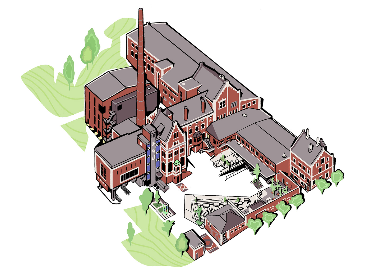
Tou is a music and art venue in Stavanger and one of Norway’s largest independent cultural institutions. Tou used to be a brewery from 1901 to 2003, and was recently refurbished with a vision of further developing the building mass, rather than build up a completely new district.
By retaining the old layout, navigating the place became challenging. Visitors often ended up in the wrong spaces.
Based on research and site visits, we defined a wayfinding strategy & signage system to help guide visitors around the historic destination.
By retaining the old layout, navigating the place became challenging. Visitors often ended up in the wrong spaces.
Based on research and site visits, we defined a wayfinding strategy & signage system to help guide visitors around the historic destination.
Credits:
Daavid Mörtl, Moxey, Oddbjørn Aarstad, Tommy Ellingsen, Christopher Jonassen, Stavanger Byarkiv
Year:
2023
Deliverables:
Wayfinding strategy, signage, illustration


With the building being a purpose built brewery, we initially did detailed studies of circulation- and user behaviour within the space.


Light sources are an important part of the system. Illuminated signs draws in visitors to key spaces and events in the evening.

As part of the signage system, a new typeface with more legibility and personality was introduced. Store Norske Geita is a Norwegian grotesk typeface drawn by Store Norske Skriftkompani, and reflects the rich history and quirkiness of the building.
To enhance accessibility and navigation, we partnered with illustrator Daavid Mörtl to create a building overview showing all entrances and key destinations.
The signage system celebrates one of the main architectural features – the iconic and original rust red facade colour.

Entrance points in the building were assigned letters for easy identification.


